Low code development is very promising, and, yet, it can be very tricky. I’ve done my share of Canvas Apps development, and if there is anything I learned about them is that there are dozens of little things that may not work, or they may not work exactly as you thought they would, and, so, you always have to be ready to pivot as you go. As in, “I can’t do it that way? Well, perhaps I can do something similar instead?”.
Keeping that in mind, it’s not surprising that the final product of Canvas App development can be somewhat different from what was planned for, and, so, when starting to work on a Canvas App, it’s totally valid to ask yourself whether it’s going to be as designed, or whether it’s not going to be as designed?
I know you might disagree, so I’ll give you a few examples, and this is going to be my introduction into the upcoming release of the “ITA Web Starter Request Handler”, which will be added to the web starter portal
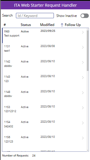
Note: I am not 100% sure if it would be better to have this implemented as a Canvas App or as a portal feature, but, for now, I thought I could have a Canvas App.
Don’t get me wrong, it did not take me long to come up with this screen and make it absolutely functional. However, as I kept going, I was adding to my list of features which I expected to be doable and which were not, so I had to pivot a few times.
When I started creating that screen, I figured it would be a good time to try modern controls. So I quickly added a table, a textbox, and a label.
Here is what went wrong and why I had to fall back to the classic Canvas App controls:
A table control could be great if it allowed us to customize data output.
As in, when there is a date time field, I might want to display date portion only. Or, if there is an empty date time field, I don’t want to see some default date in the output
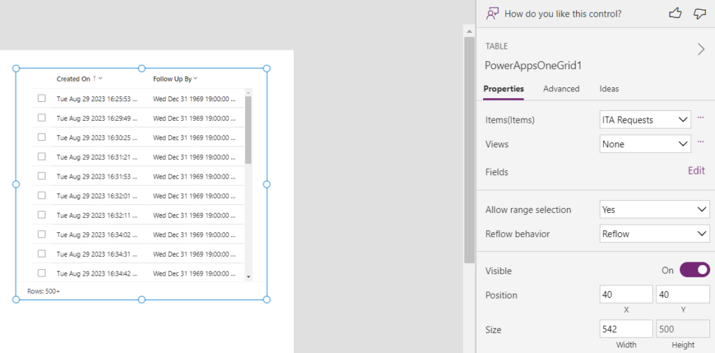
It seems, though, there is no way to define the formula, or, at least, it’s not working as I thought it would- no matter what I do, the output does not change. Although, there is no “Text” or “Value” property either, so that might be part of the problem:
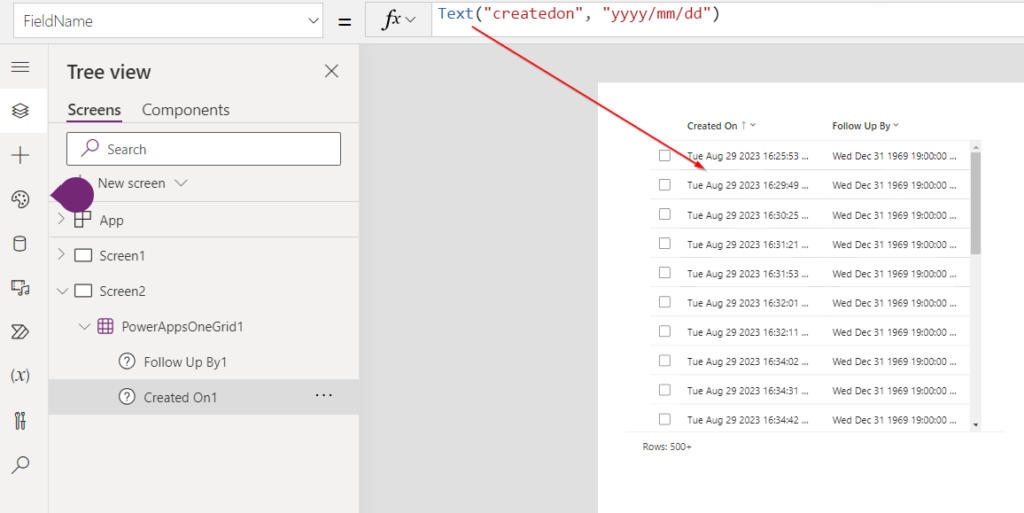
So, for the time being, let’s fall back to the good old gallery.
Ok, those are still in preview, so let’s try another one and see if that works out better. I’ll definitely need a text input control in my app:
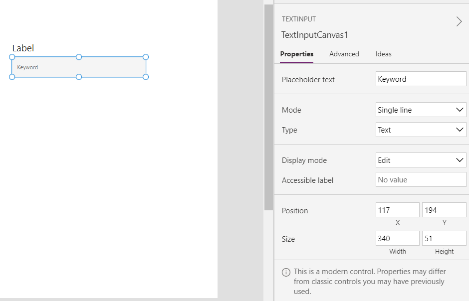
The disclaimer at the bottom of that screen about this being a modern control and the properties being different will likely give you a hint of what I’m getting at, but why are we missing the following 3 properties completely:
- Font Size
- Background Color
- Border
On the same screenshot above, you’ll notice there is a label, too, which is another modern control, but, for some reason, it does have font size property. Though it’s also missing the other two.
Compare that text box to the classic one:
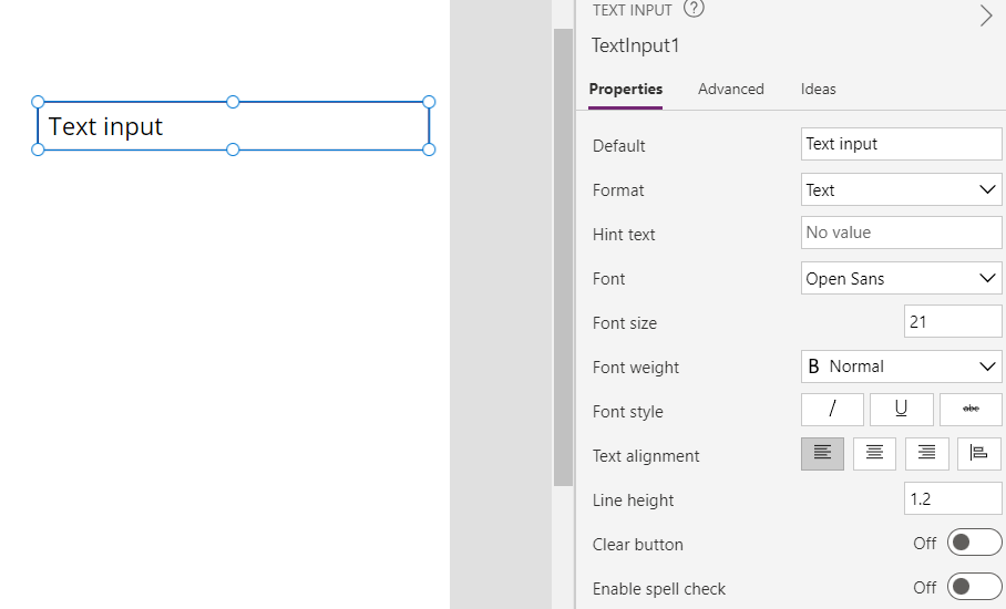
It definitely does not look that nice, but it has all the properties I need.
So, well, I thought this app would have modern UI, but, at this point, it’s just going to rely on the classic controls. Unfortunately, that also means a couple of hours got lost on trying to make sense of the modern ones. Hopefully, modern controls are going to catch up, though, since they do seem to look better in general. If only they were on par in terms of the functionality.
But I am not done with my rant yet.
With all the above, I switched to a regular vertical gallery control, started to use classic text boxes again, so things were going smooth until I tried to implement column sorting in the gallery.
In general, the gallery itself does not care of course – it’s just using its items property to display those items. So we just need to sort the items.
However, how do we implement “dynamics” sorting where the user would click on a column title, that would change the sorting order, perhaps remove that column from sorting, etc.
This way or the other, we need to use “Sort” function:
Sort( Table, Formula [, SortOrder ] )
Or we can use SortByColumns:
SortByColumns( Table, ColumnName1 [, SortOrder1, ColumnName2, SortOrder2, … ] )
The problem I keep running into with those two is that this all has to be hardcoded in the formula. In other words, you have to decide, upfront, that first you’d be sorting by column A. Then by column B. Then by column C. Etc. And if you choose to apply sorting to the columns in a different order you need a new formula. Yet if you choose not to apply sorting to one of the columns, you need another formula. Which, eventually, turns into a long list of “If” or “Switch” conditions.
Would probably be nice if the parameters could be made “Blank” so I’d be able to include/exclude those columns as needed. Although, with this simple app, I can probably live with just one column being sortable, so it’ll be the “follow up” one:
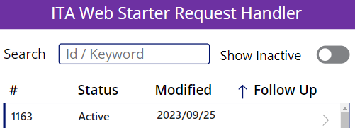
As you can see, the question of what it’s going to be, in the end, is still up in the air I’ll know once I’m done with, hopefully in a few days, and, then, I’ll write another post about it. But this is a good illustration of why Canvas Apps can be tricky – you sort of have to find your way through all the feature and functionality sometimes to figure out what’s going to get you closer to the original design.