When creating a custom PCF control for a subgrid, how do you display “add new item”, “quick find”, and other commands/actions/navigation items which you would normally see accompanying the subgrids on the forms?
That’s what I was recently asking in the community forums:
Once again, folks from the PCF team have raised to the challenge and provided the answer. It did not come without a few caveats, though.
When defining a dataset in the control manifest file, I can add the following attribute:
<data-set name=”tableGrid” display-name-key=”Table Grid” cds-data-set-options=” displayCommandBar:true;displayViewSelector:false;displayQuickFind:true”>…
This instructs model-driven form to display the command bar, not to display the view selector, and to display the quick find (they may have to be enabled when adding grid to the form in the designer, too).
This did not work at first, though, and I was getting the following error when trying to build the control:
Manifest validation error: instance.manifest.control[0].data-set[0].$ additionalProperty “cds-data-set-options” exists in instance when not allowed
This error, as it turned out, was caused by a setting in the ManifestSchema.json file located in the which the node_modules\pcf-scripts subfolder:
Manifestschema.json (which is in the node_modules\pcf-scripts subfolder) had this:
“dataSetAttribs”: {
“type”: “object”,
“properties”: {
“name”: { “type”: “string” },
“display-name-key”: { “type”: “string” },
“description-key”: { “type”: “string” }
},
“required”: [“name”, “display-name-key”],
“additionalProperties”: false
},
Using “true” for additionalProperties did the trick – I was able to build the control, and I got the quick find & the command bard displayed on the form.
Well, if you look at the community thread I mentioned above, you’ll see this might not be supported in the future. Although, on the other hand, we can probably figure out how to add those parameters directly to the resulting customizations.xml file even if we can’t add them through the control’s manifest.
So far so good, but there are a few more things there.
The whole purpose of the control above was to basically display the same grid as usual except that I wanted to have a special on/off switch control for the two-options field.
If kind of worked, but, if you compare that screenshot above with the screenshot below, you’ll see how the second column is different now:
This is because my Quick Find view is not using the same set of columns as the original view, so, even though the control is expecting that there will be a Boolean attribute in the second column, and, normally, that’s how it is if the selected view is configured properly, that quick find (even though useful otherwise) starts breaking this perfect picture.
Can’t see any good solutions for this. I might add code to look at the column and only display that switch when it’s a two-options field, but, it seems, I’d have to re-create out-of-the-box rendering then(for all the different attribute types), and I’m not sure I’m really up to it. So, for now, I’ll probably just have to remove quick find.
As for the paging, it seems it has to be custom. As far as I can see, there is no way around it yet.
One other useful feature I did not realize was there is the ability to add default values to the parameters. If not for Guido Preite who provided the solution here: https://powerusers.microsoft.com/t5/PowerApps-Component-Framework/Default-values-for-quot-input-quot-properties/m-p/304561#M436, I might still be looking.
All I had to do is add default-value attribute to the control property:
<property name=”optionsMapping” display-name-key=”Options Mapping” description-key=”Options Mapping” of-type=”SingleLine.Text” usage=”input” required=”true” default-value=”True:True;False:False” />
Now that I have the command bar and I can add a default value… it seems it’s time to work on a few improvements for the CheckBoxList control since I need to:
- Add a few configuration settings
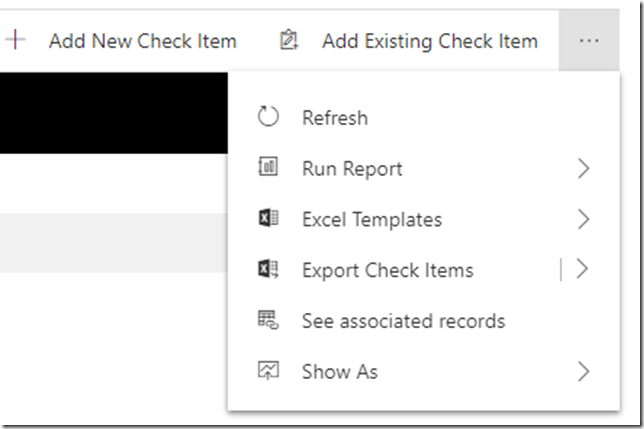
- Figure out what to do with the options that are now showing up in the dropdown below – I want the ability to add new items, but I’m not sure Show As and some other options make sense. Besides, there is no “delete”… which probably have something to do with my control not supporting item selections yet:
This is probably to be continued…


Probably to be continued? You can leave this drama here! We need the happy ending!
I meant “can’t leave”
I have created custom control for the opportunity view and want to see the custom button as it is like close as won and close as lost when record is selected.
Any clue how we can achieve the same.