I am not sure what’s been happening to the PowerApps product team recently, but, whatever it is, I think a “thank you” is in order.. it just seems they are really working on tiding up the UI these days.
Just today, I noticed a couple of new(?) things, and it feels like.. an unexpected gift. No, really.
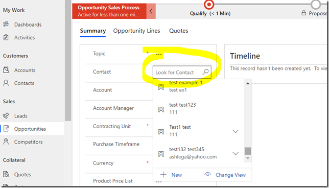
I can scroll through all the records in the lookup control now. It will open up with some records loaded, and, then, it will load more data as I keep scrolling. This is it – dark days of the classic UI are over!
But there is one less reason to use optionsets in place of lookups now.
Actually, I don’t know when this change happened. Has it been there for a while and I just did not see it?
What I do know, though, is that only a week ago I made this post:
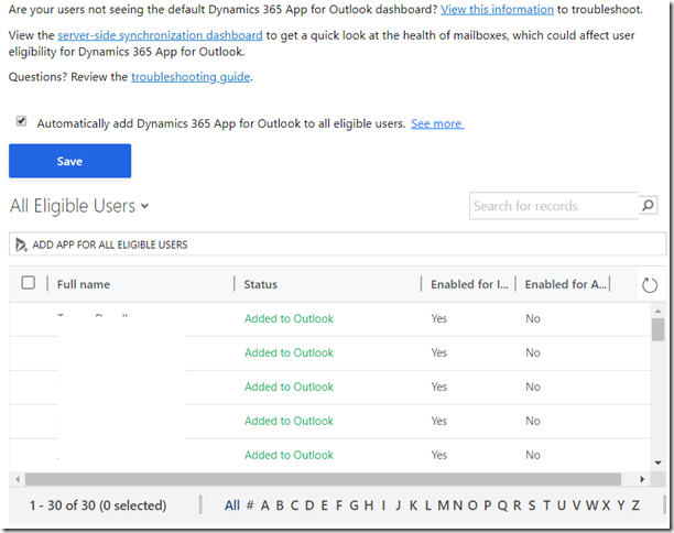
And I‘m pretty sure the post itself does not have anything to do with the fact that it’s not an issue anymore and the grid is not truncated:
Well, it’s been a good day, it seems![]() )
)

