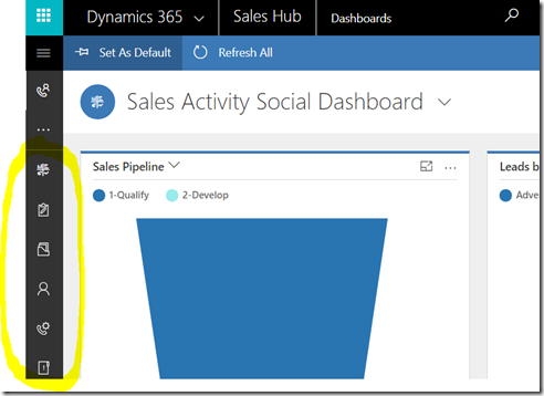
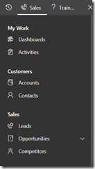
When working with the Unified Interface in Dynamics, we have application navigation area on the left side:
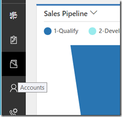
Ideally, Dynamics should be providing a tooltip for each of the icons in that menu. Like this:
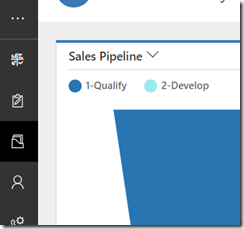
However, every now and then you or your users will notice that it looks more like this:
You can’s see mouse pointer on the screenshots above, but, it’s positioned almost exactly the same on both of them – the only difference is that, when the tooltip shows up, the mouse, is, actually, positioned just outside of the icon (in the black area surrounding it).
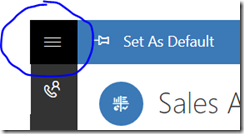
So, if your users start saying that they can’t easily see the entity names since those tooltips are not showing up, just ask them to:
